
Sensei
Brand identity and packaging redesign for an affordable charging cable brand.
Sensei is a summer project that began as a packaging redesign and grew into a full brand identity. After looking across Tesco, The Range and B&Q, I landed on Sensei charging cables, drawn to their tech-led, minimalist aesthetic. I picked three very different cables for variety: a standard Lightning to USB, a colourful Type-C to USB Pastel, and a 5-in-1 to challenge myself.
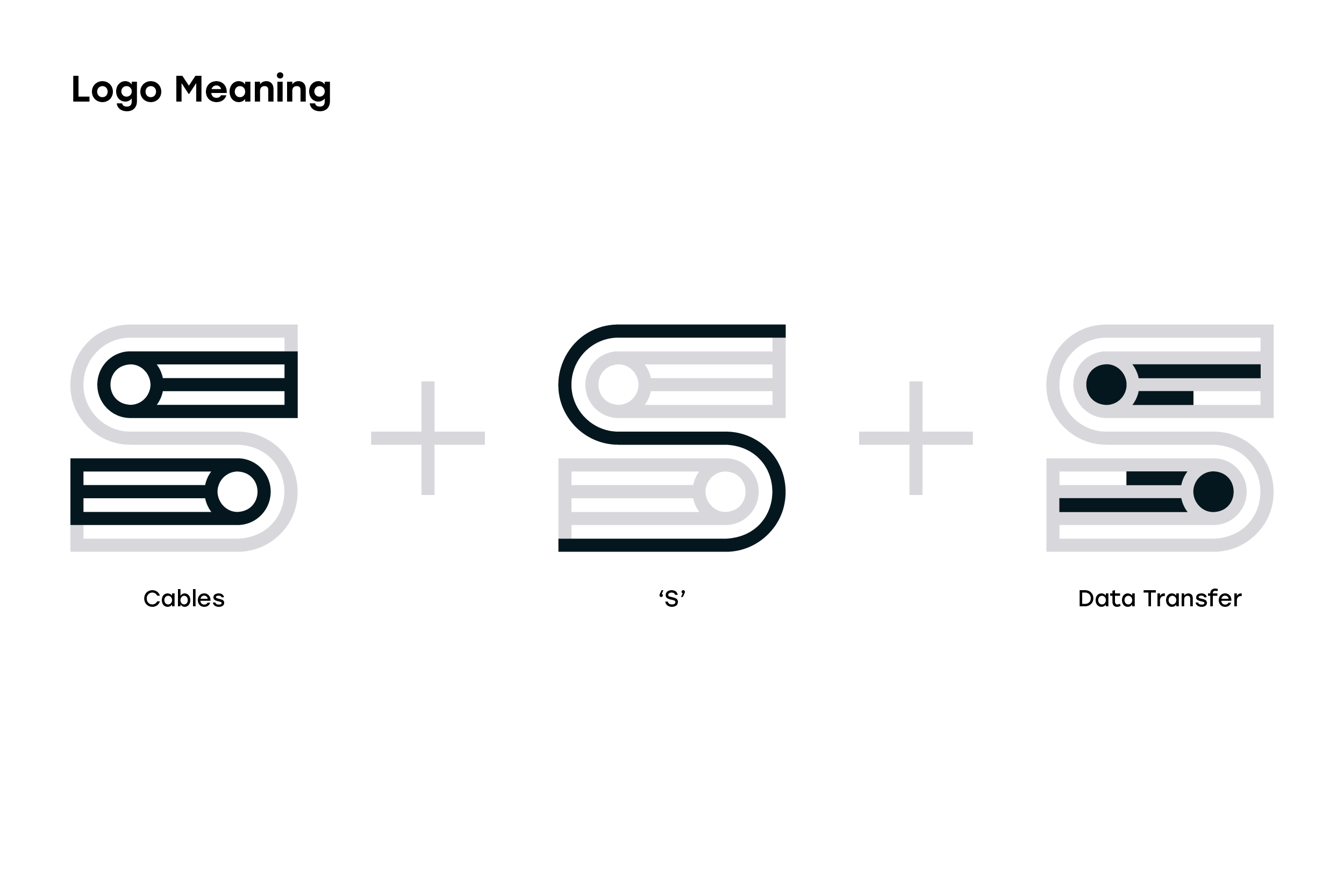
At around £3–£7 these are lower-mid-range products, aimed at budget and eco-conscious shoppers who want something cheap but durable. From this I built a new identity around reliable quality and convenience, designing a logo that combines an ‘S’ with the forms of cables and data transfer.
The packaging carries this through with a functional, minimal layout that puts technical information up front for shoppers scanning a shelf, using blue with a single bold accent per cable to keep it feeling higher-end.
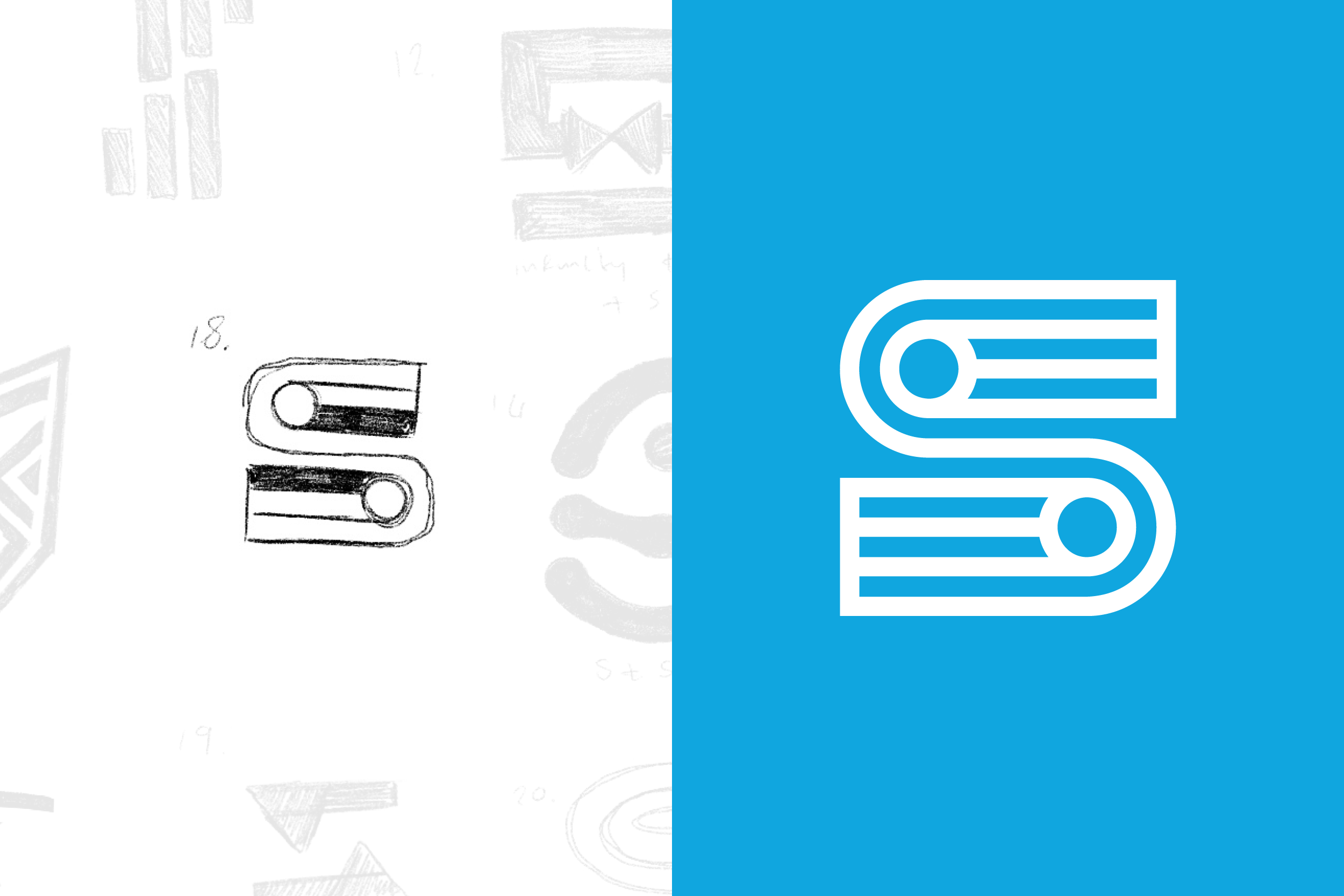
Logo
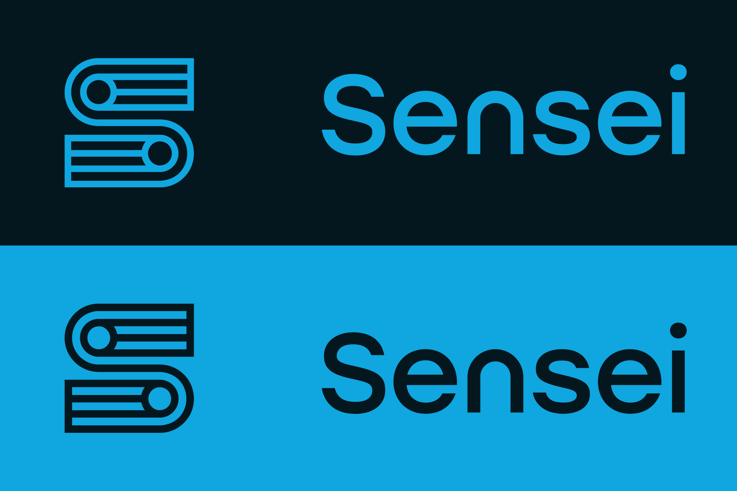
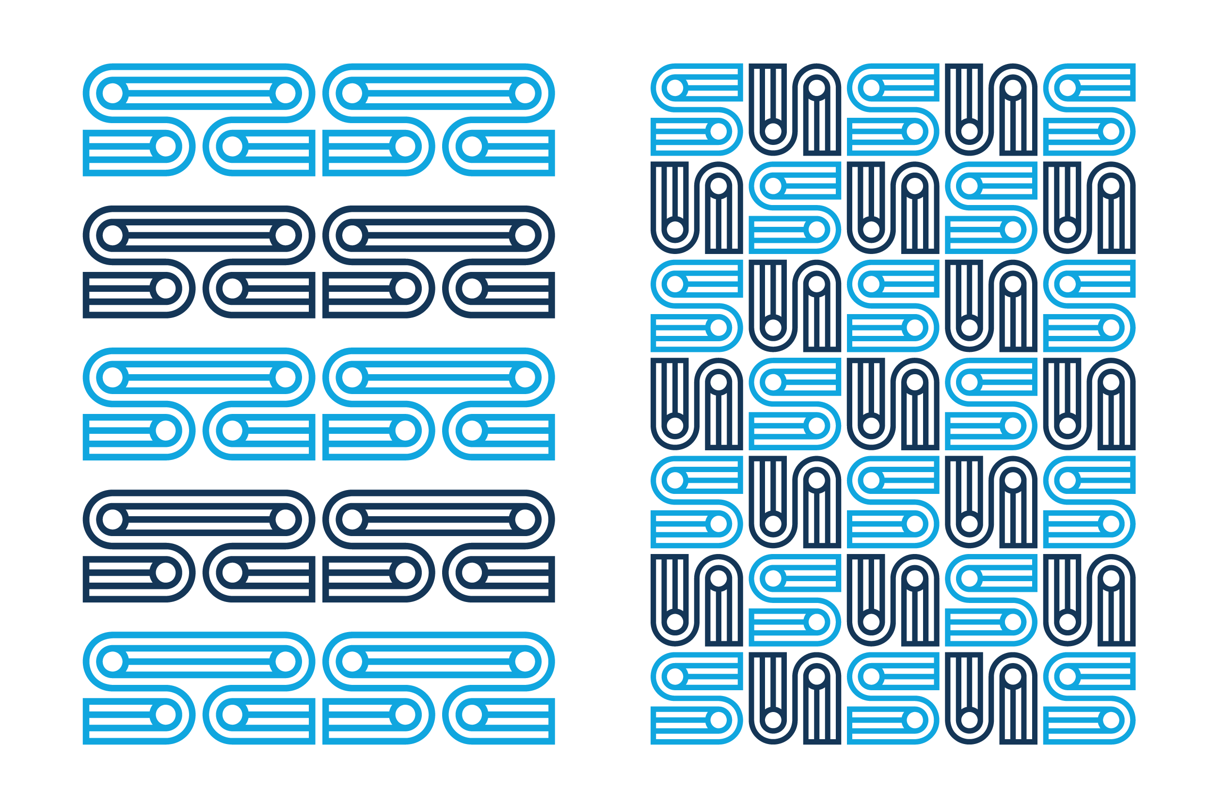
The logo icon was selected from 15 concepts for its clean, modern feel. It combines an ‘S’ for Sensei with the form of charging cables, reflecting the brand’s core product and a visual of data transfer to represent technology.
Colour Palette
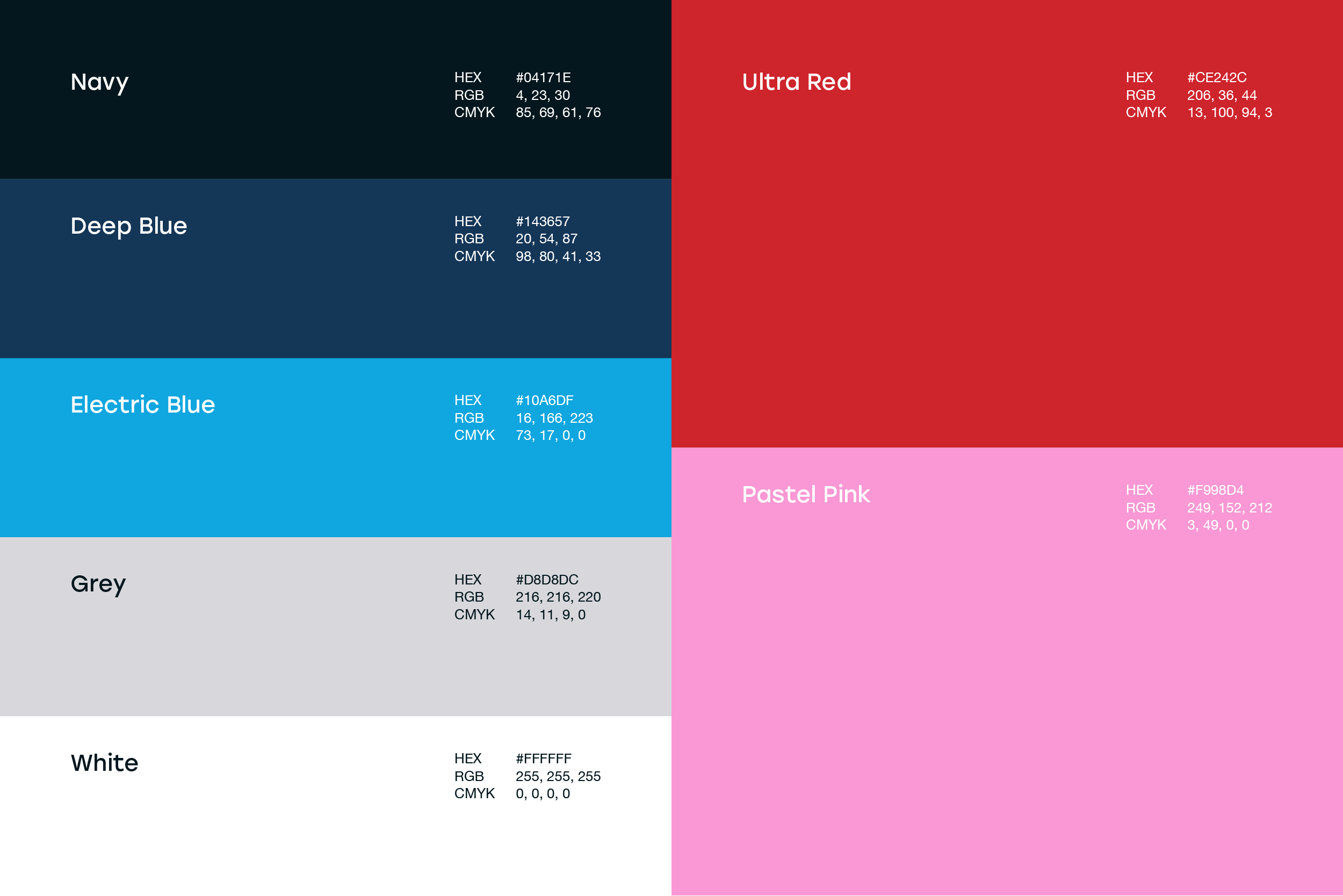
The consistent use of Sensei’s blue, black, and white colour palette across its brand identity reinforces trust and reliability, strengthening its position as an affordable technology brand.
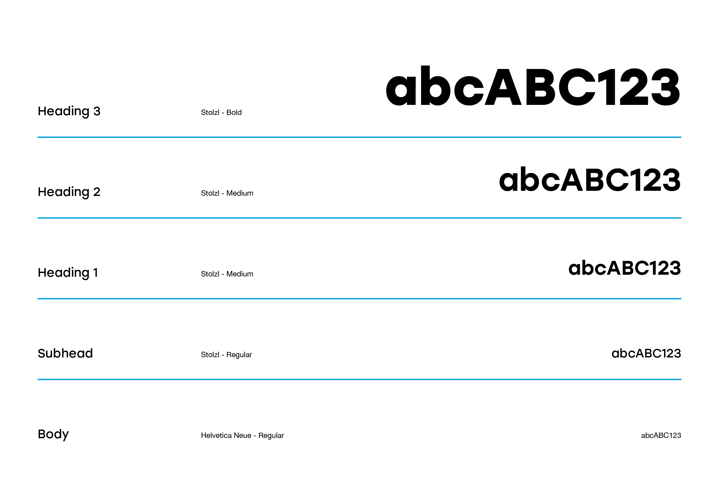
Typography
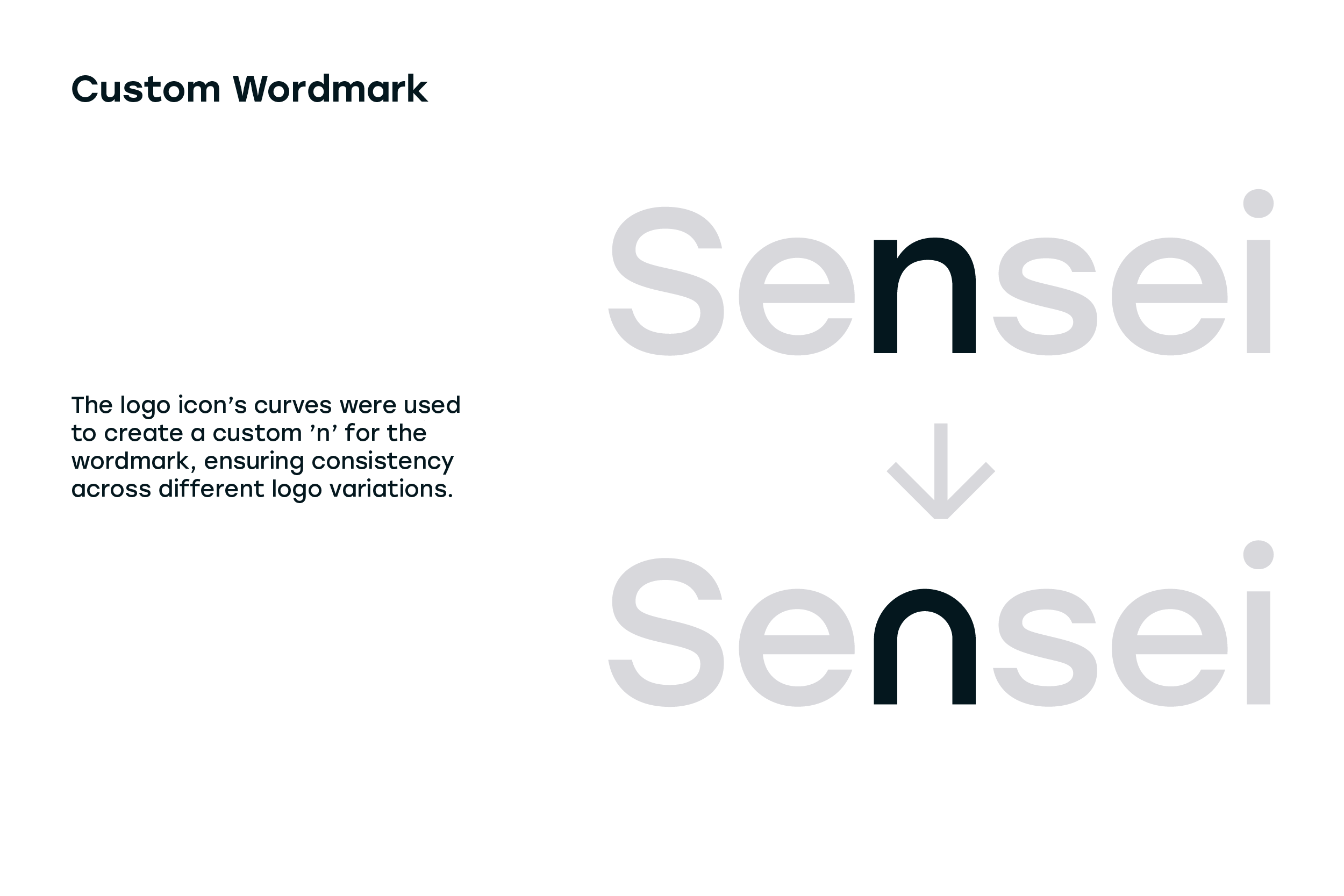
Two clean, legible typefaces were selected for the brand’s typography. The body typeface prioritises readability, ensuring accessibility for consumers of all ages. A rounded, friendly sans-serif is used for headings, reinforcing a trustworthy and approachable brand tone.
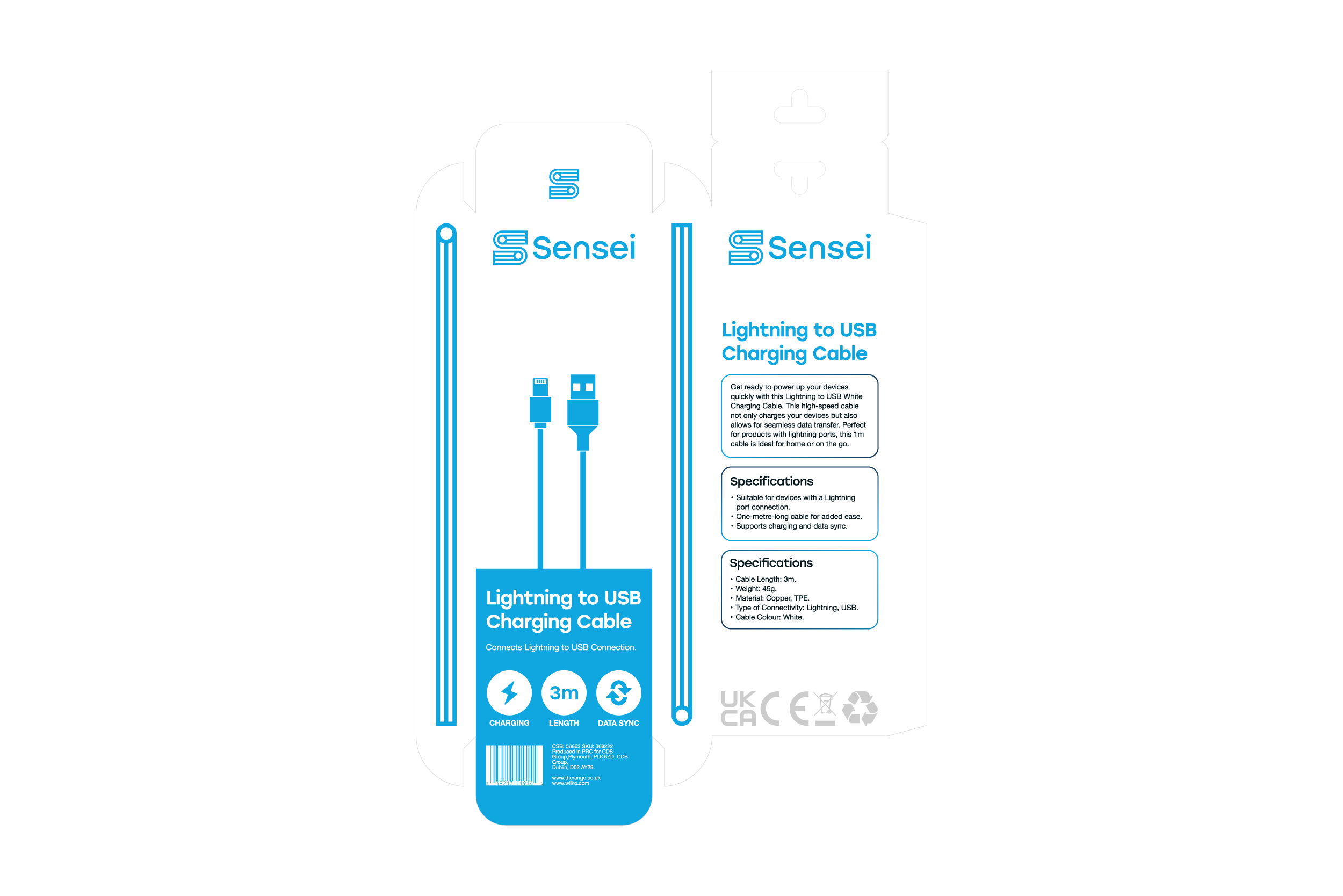
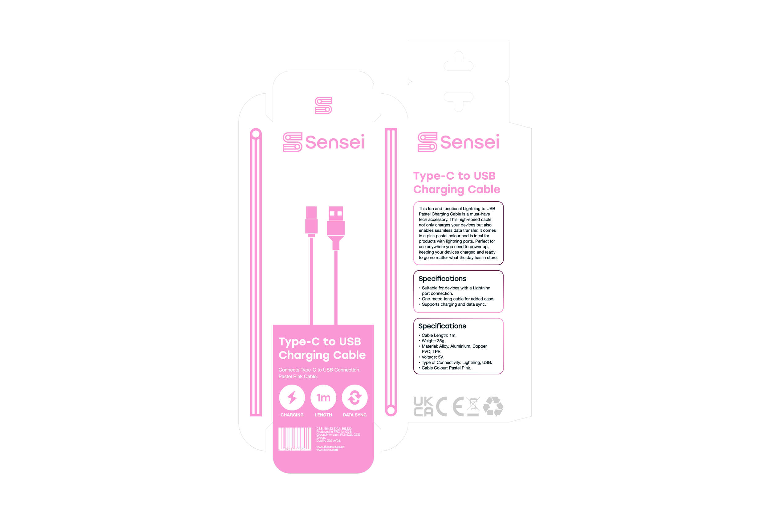
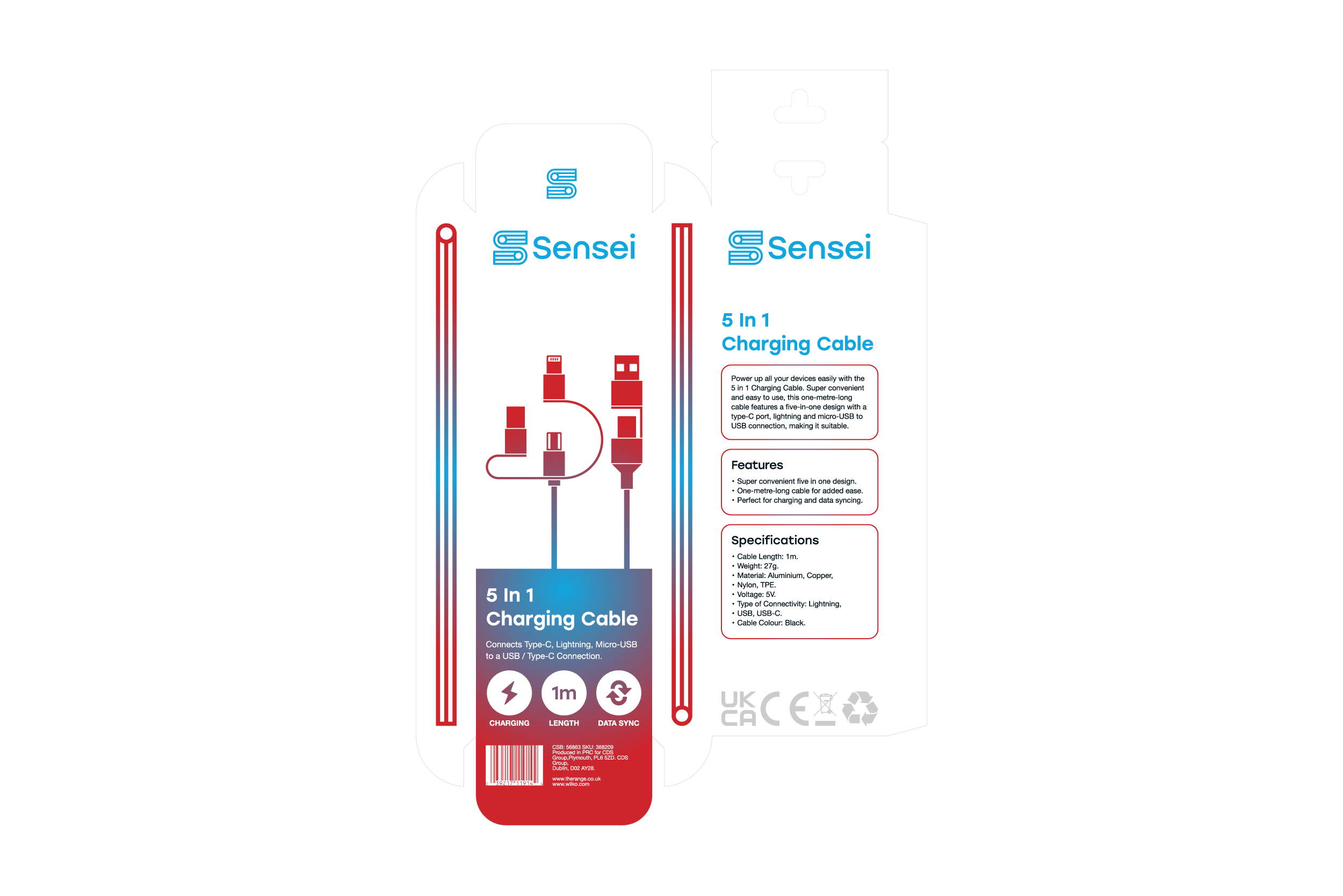
Packaging
Simple, clean packaging was developed for three products, using a clear layout to maximise legibility for a wide range of consumers. Brand elements, such as the cable motif from the logo icon, are extended onto the packaging to create visual interest. Colour is used strategically: the brand’s blue acts as the core base, while individual accent colours differentiate products based on key features. For the most advanced product, the ‘5 in 1’, a red-to-blue gradient is introduced to communicate increased performance and capability.