
The Big Three
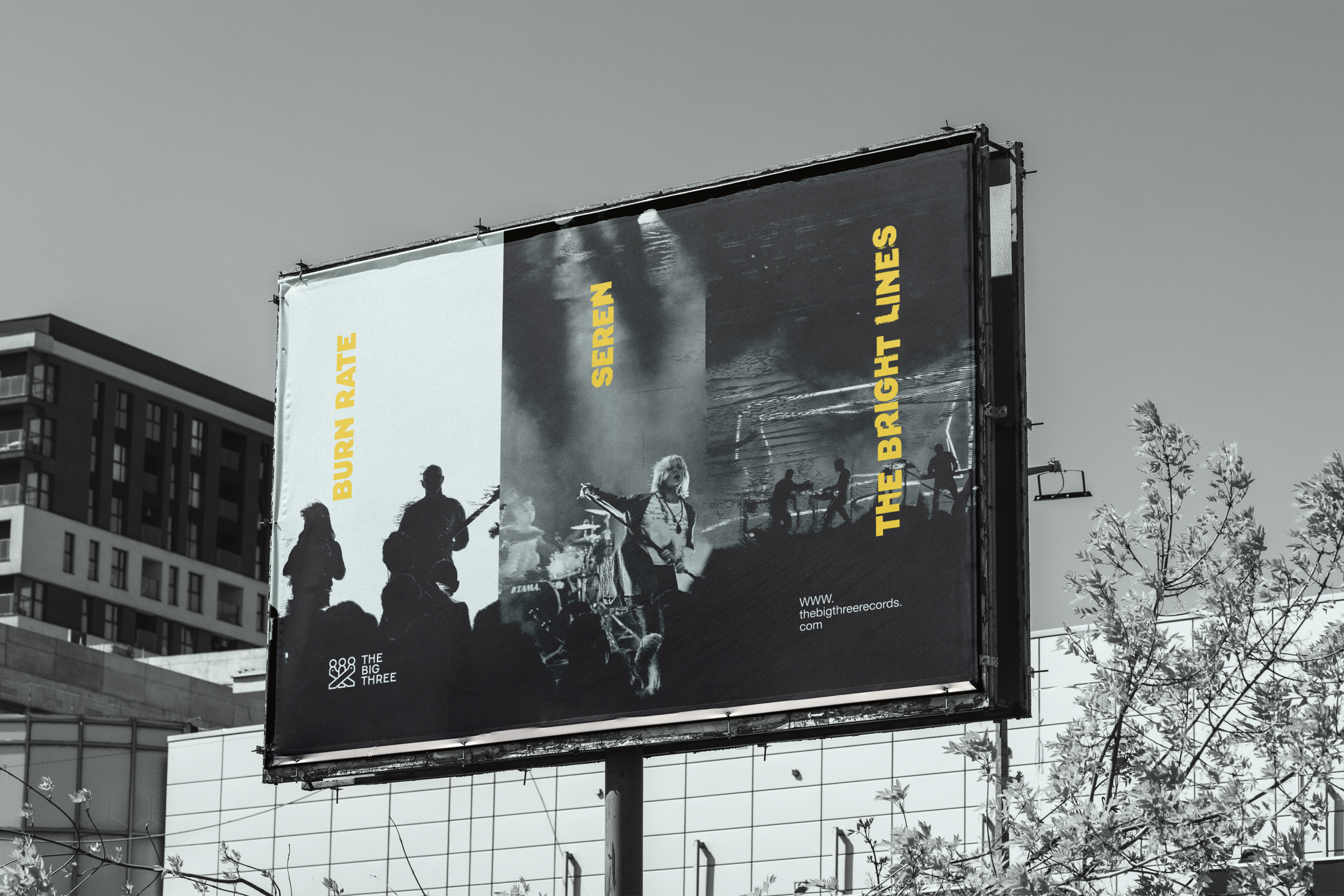
Brand Identity and album artwork for a conceptual record label based around the number 3.
The Big Three is a conceptual independent record label built around the number 3 and the Moirai: the Fates of Ancient Greek mythology. This personal project involved developing a complete identity system that could flex across the label's branding and the records it releases, including three fictional artists and full vinyl artwork for each of their albums.
In Greek mythology, the Moirai are the personifications of destiny. The Big Three plays on this idea: the name refers both to the only three artists the label signs and to the label itself as the determiner of those artists' fates.
To carry this message through the branding and album artwork, I set strict rules to achieve cohesiveness: a rule-of-thirds grid and a palette of only three colours run through everything The Big Three produces, from the label's identity to each artist's record.
Industry: Entertainment
Disciplines: Brand identity, logo design, album artwork
Year: 2026
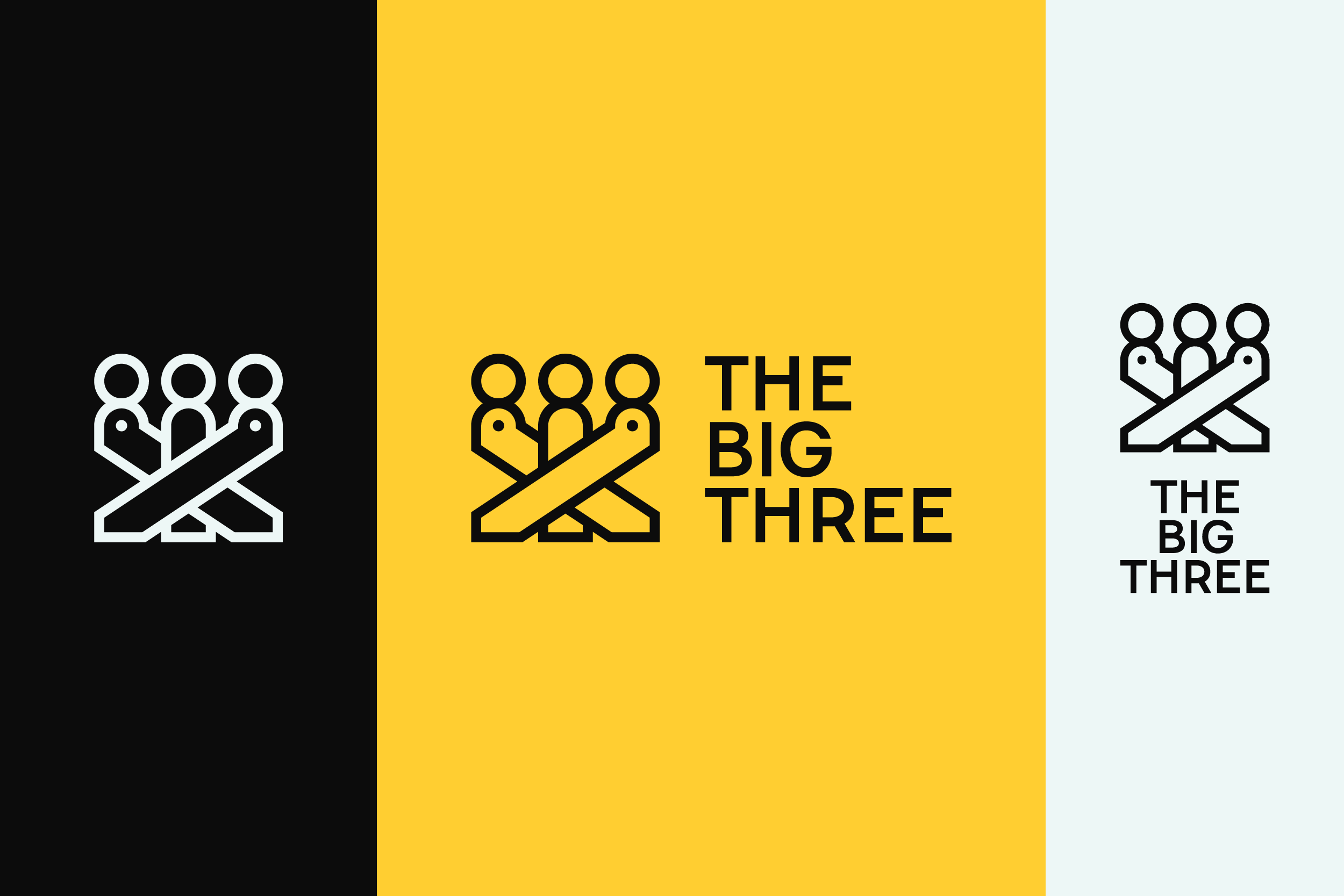
Logo
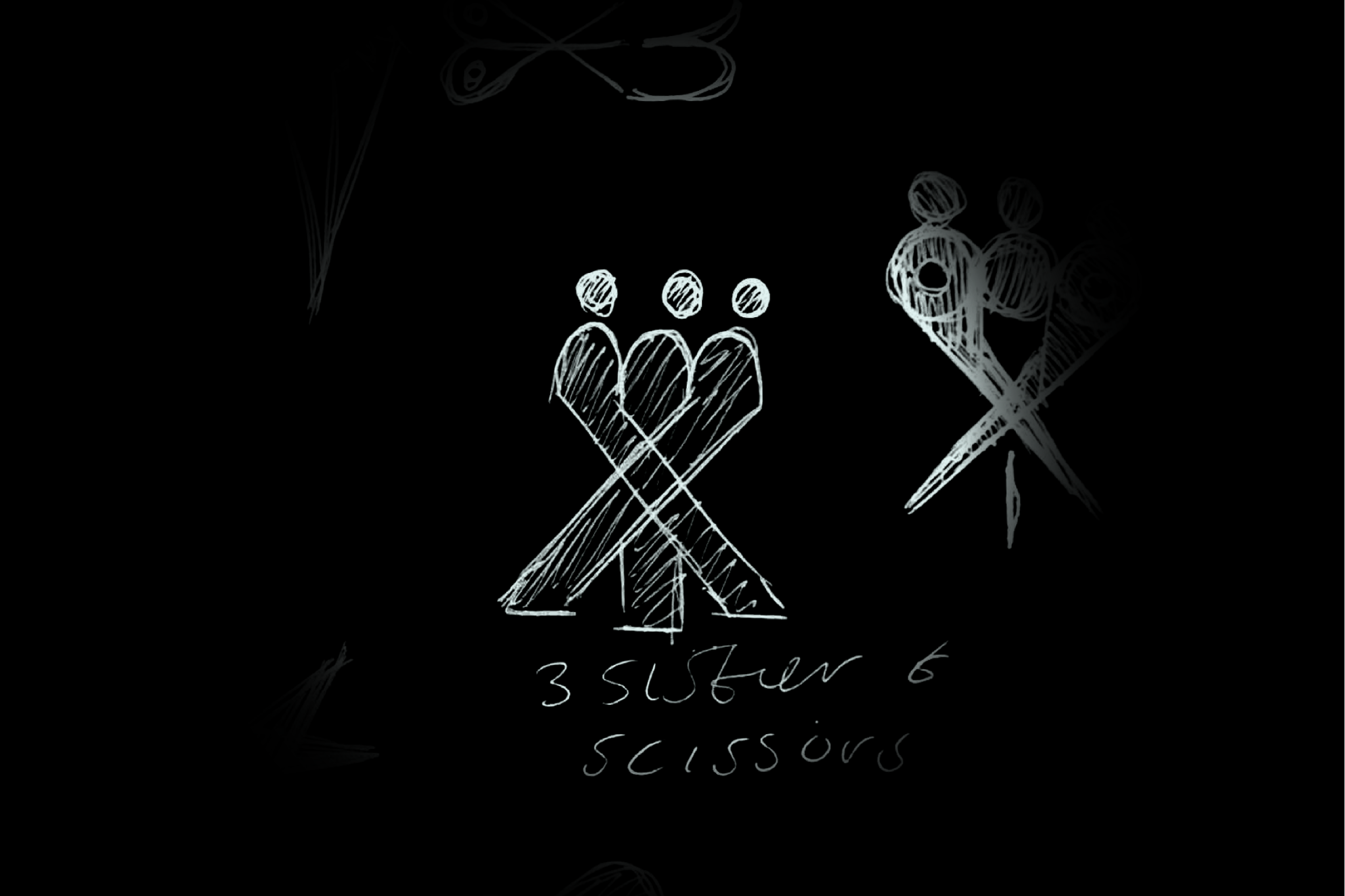
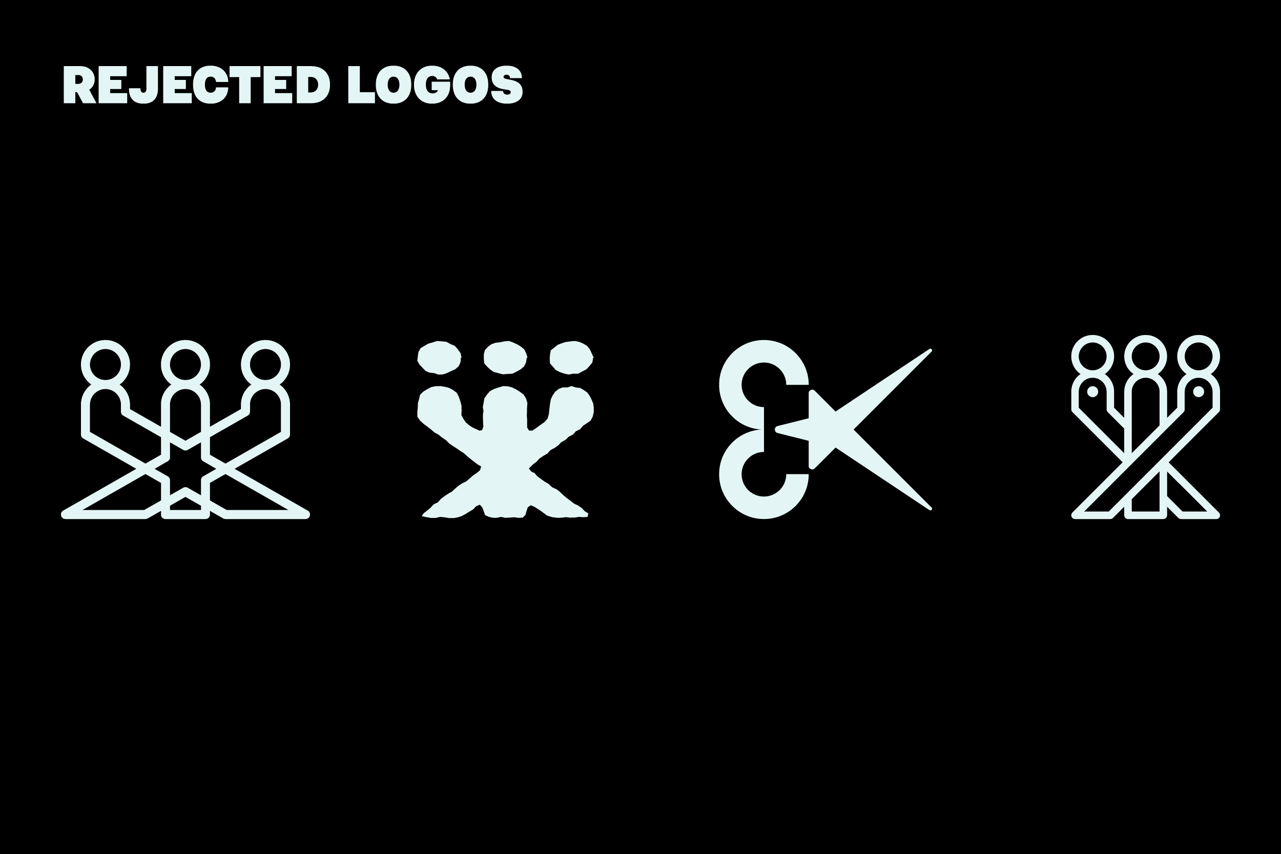
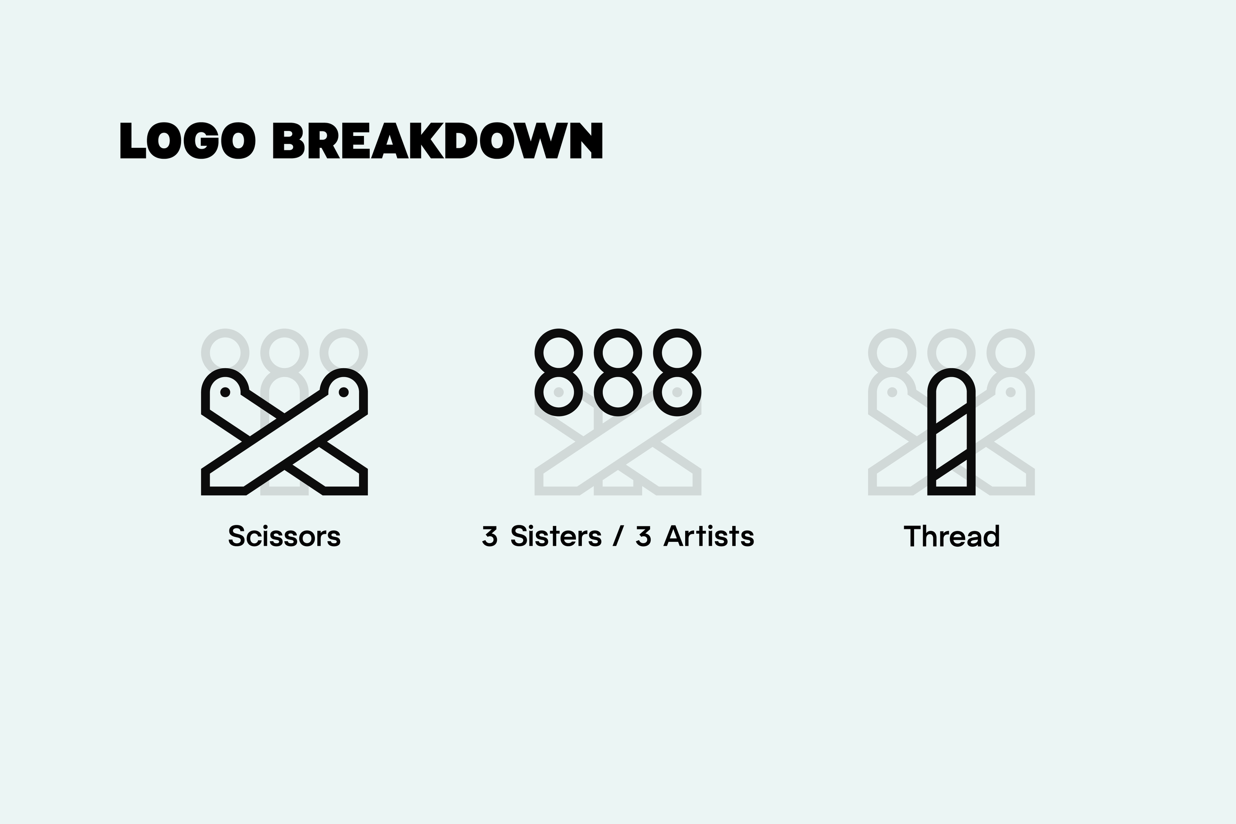
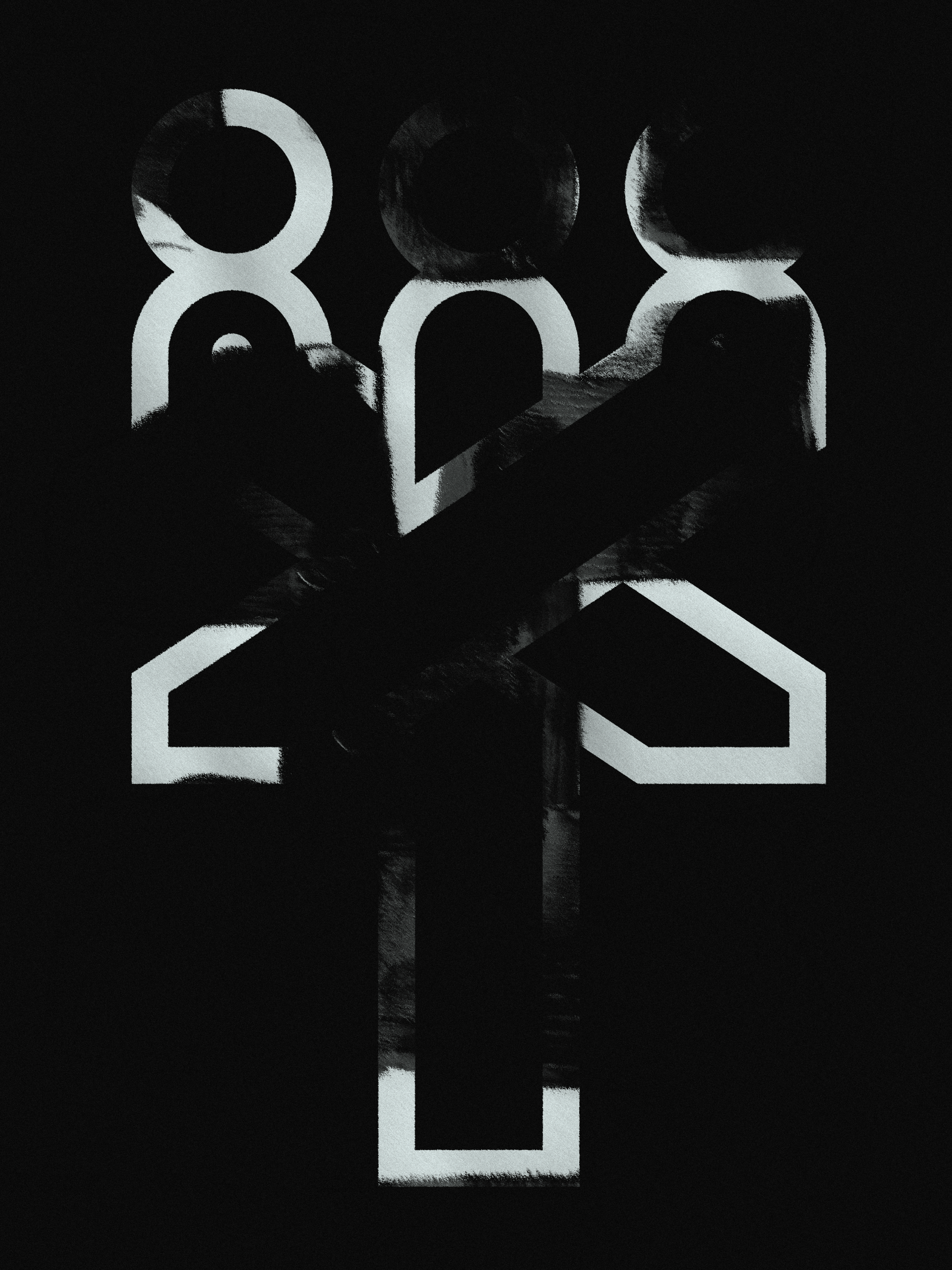
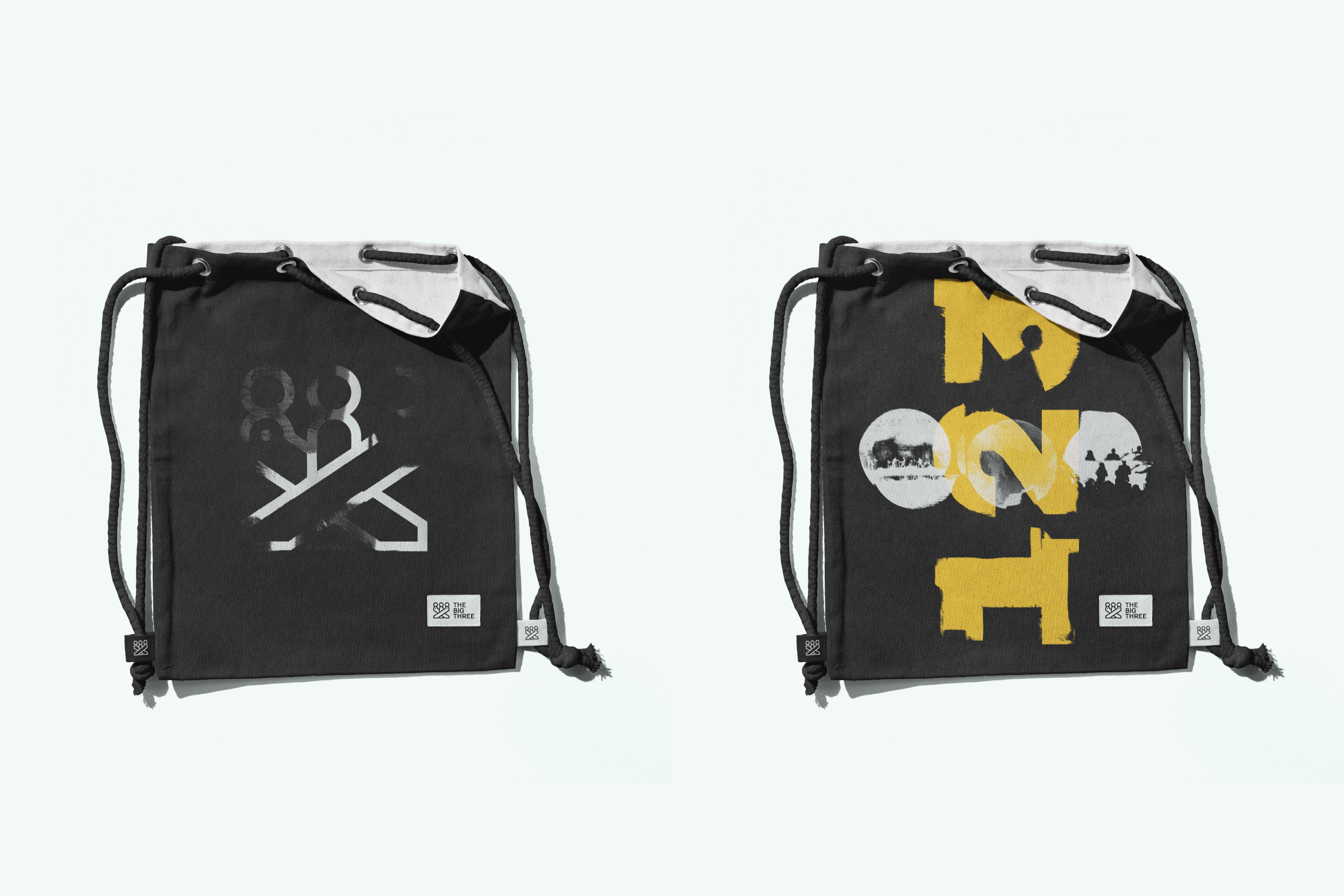
I developed the logo by exploring marks built around the number 3 and the Moirai. Some ideas incorporated the scissors the Fates use to cut the thread of life; others explored the idea of three artists, or three sisters. The aim was to create something that felt sacred, like it could be carved into stone. The final mark weaves together three figures (the artists and the sisters), intertwined with scissors and a thread.
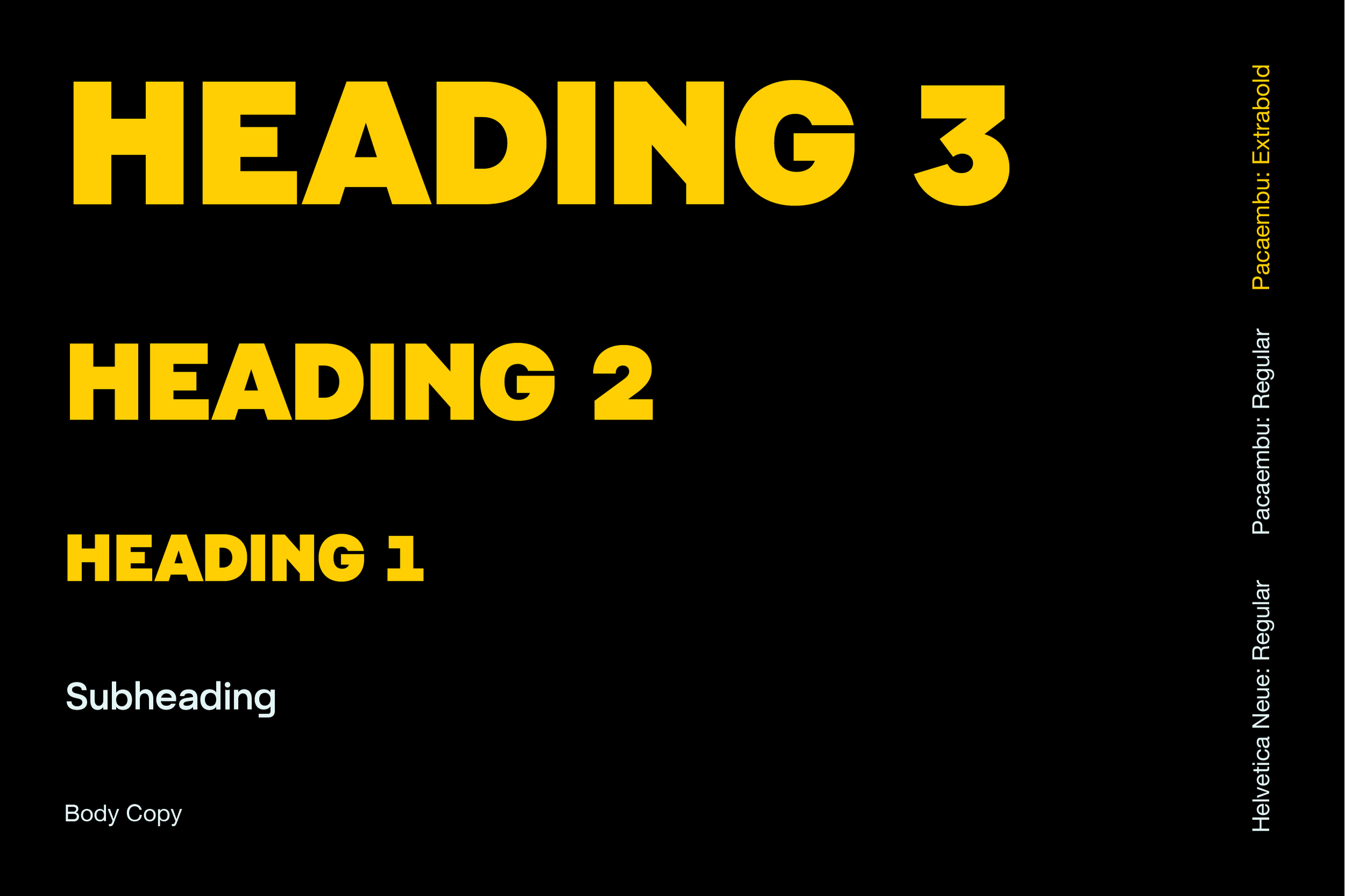
Typography
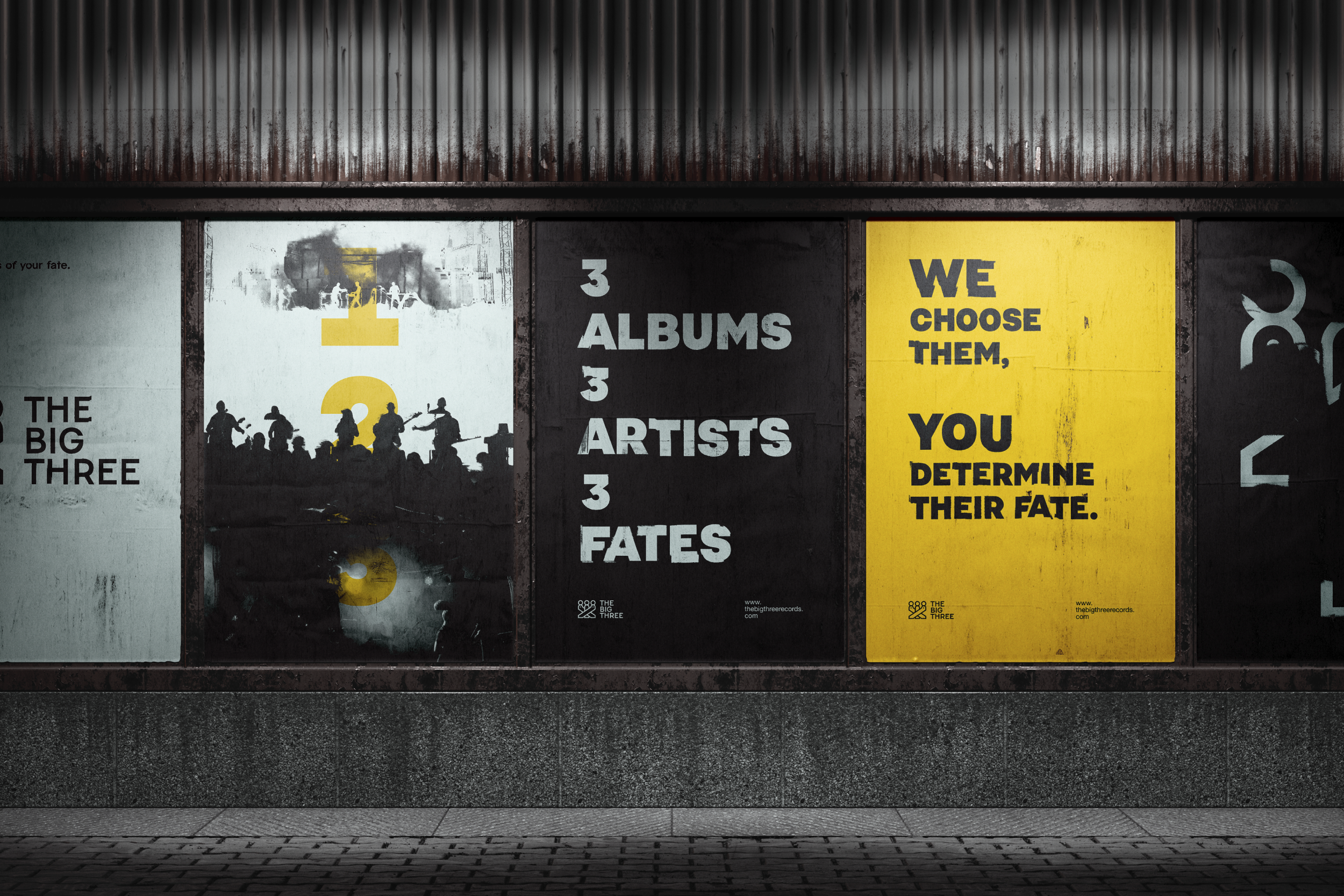
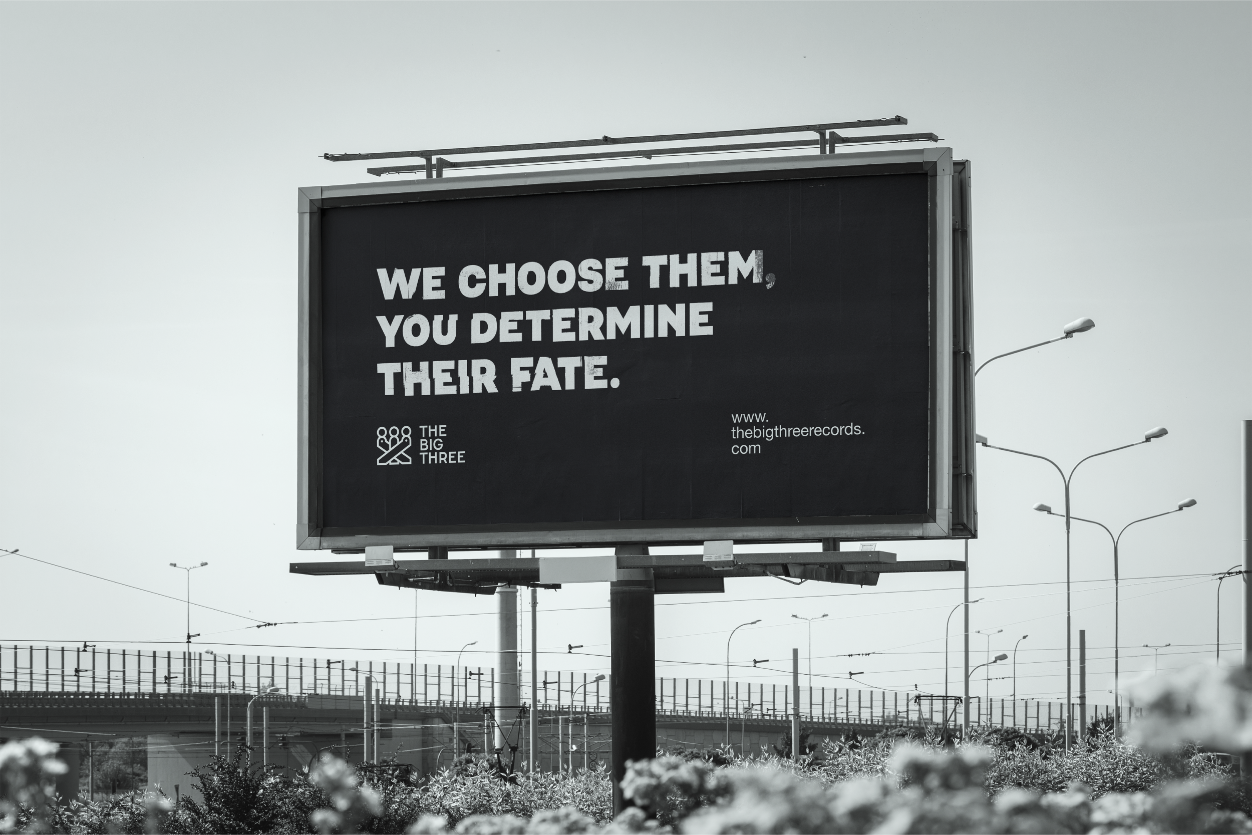
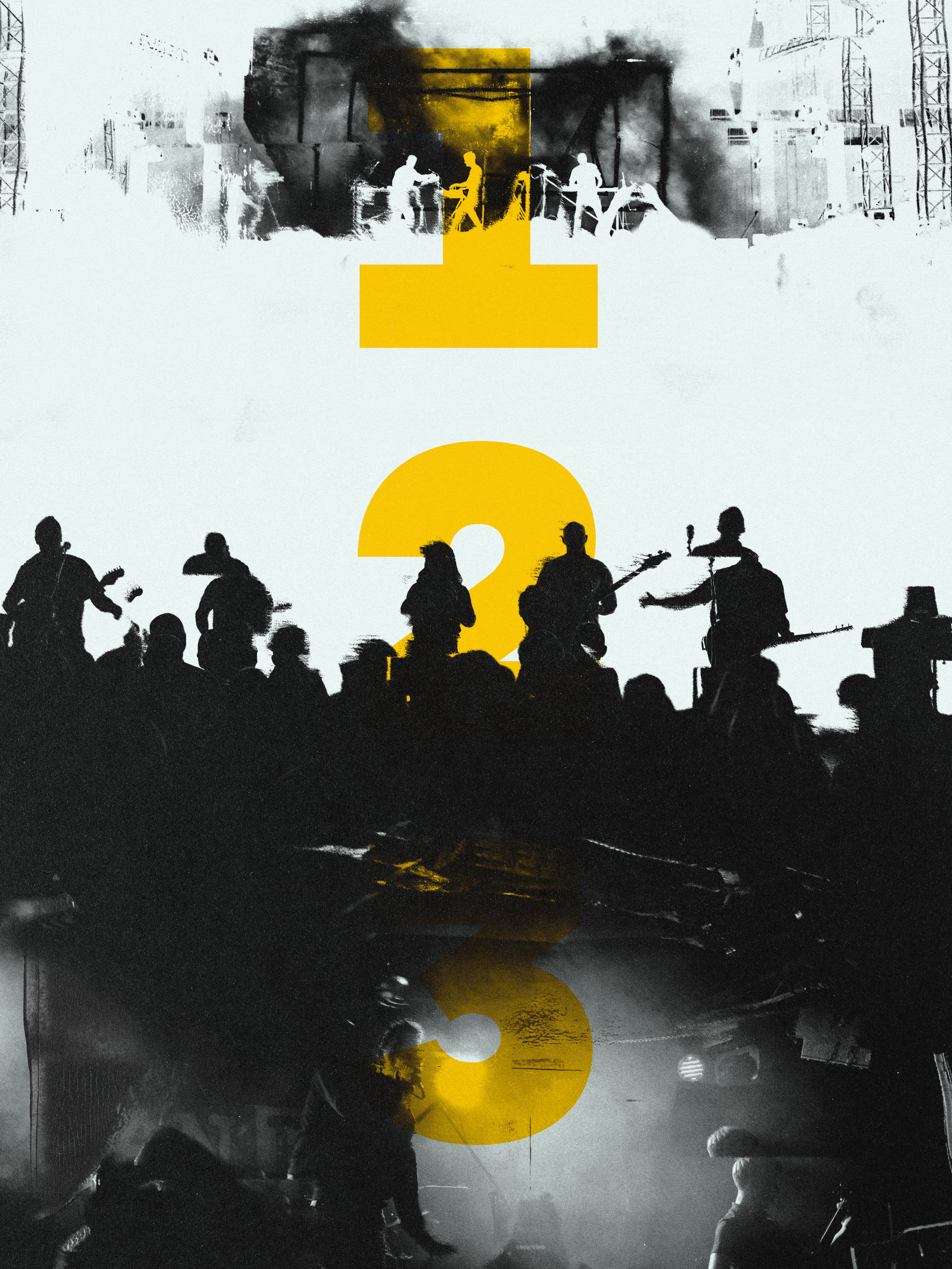
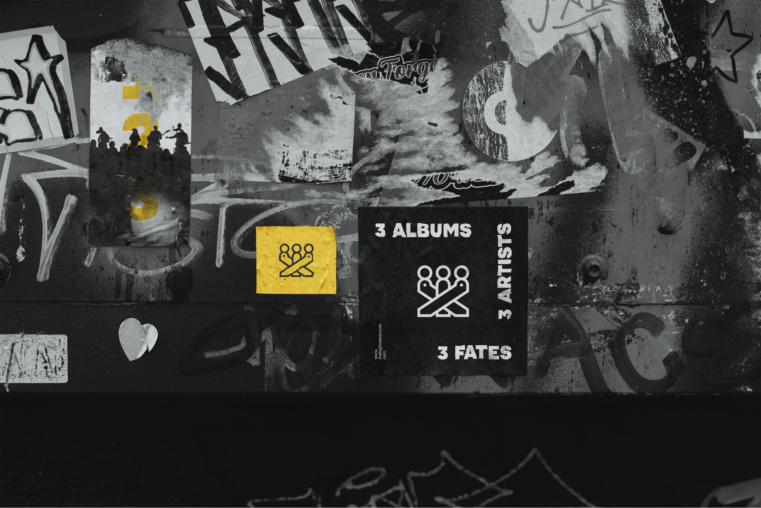
Bold, heavy type carries the main messages of The Big Three, conveying the power behind the label. Distressed texture reinforces its authority over the artists' fates and gives the branding a cryptic quality.
Colour
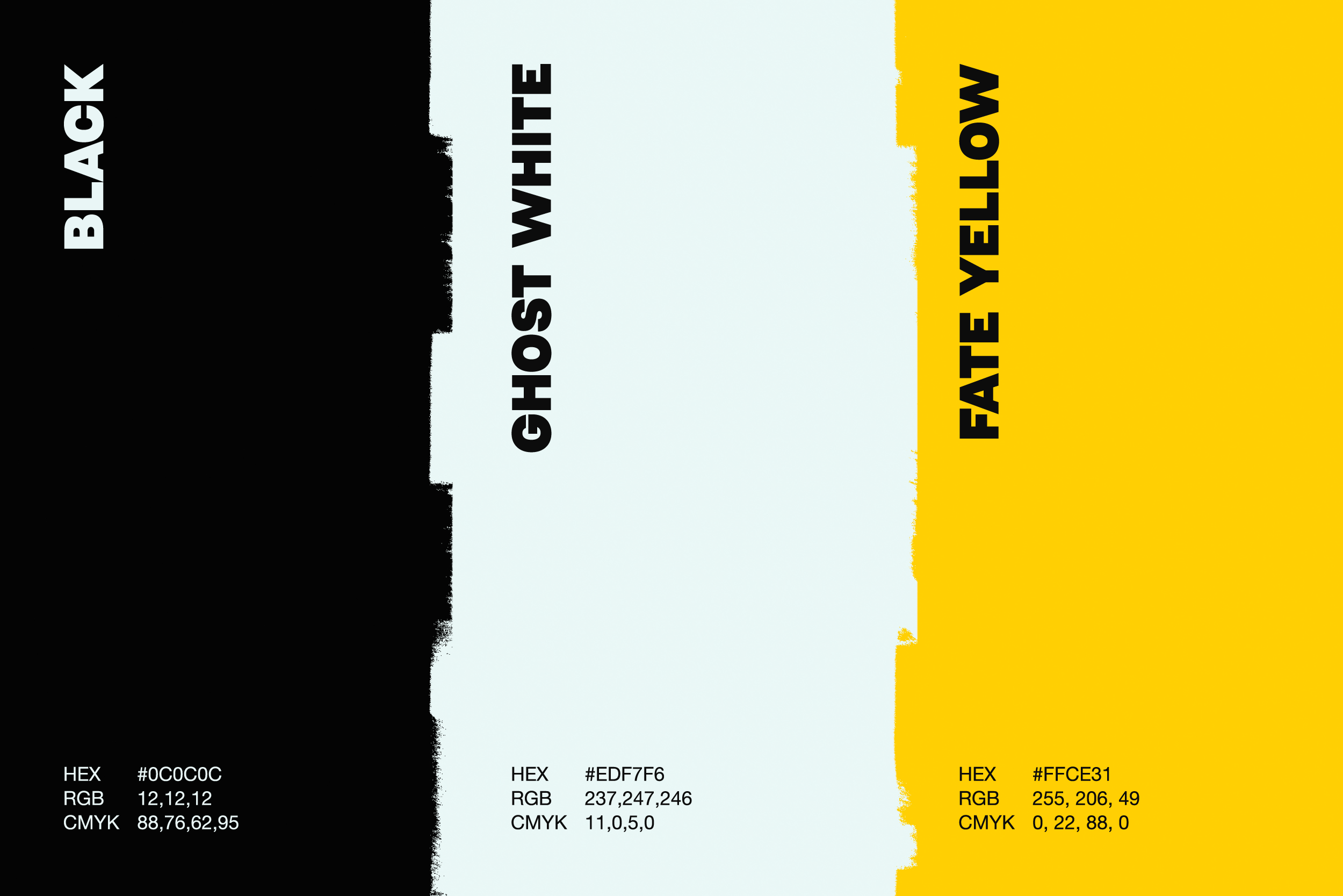
Sticking to the rule of three, three colours were chosen to represent The Big Three identity: Black, Ghost White, and Fate Yellow. These colours were chosen to create heavy contrast, representing both light and dark, the good and bad that can come with someone’s fate.
The Albums
Electric Summer by The Bright Lines
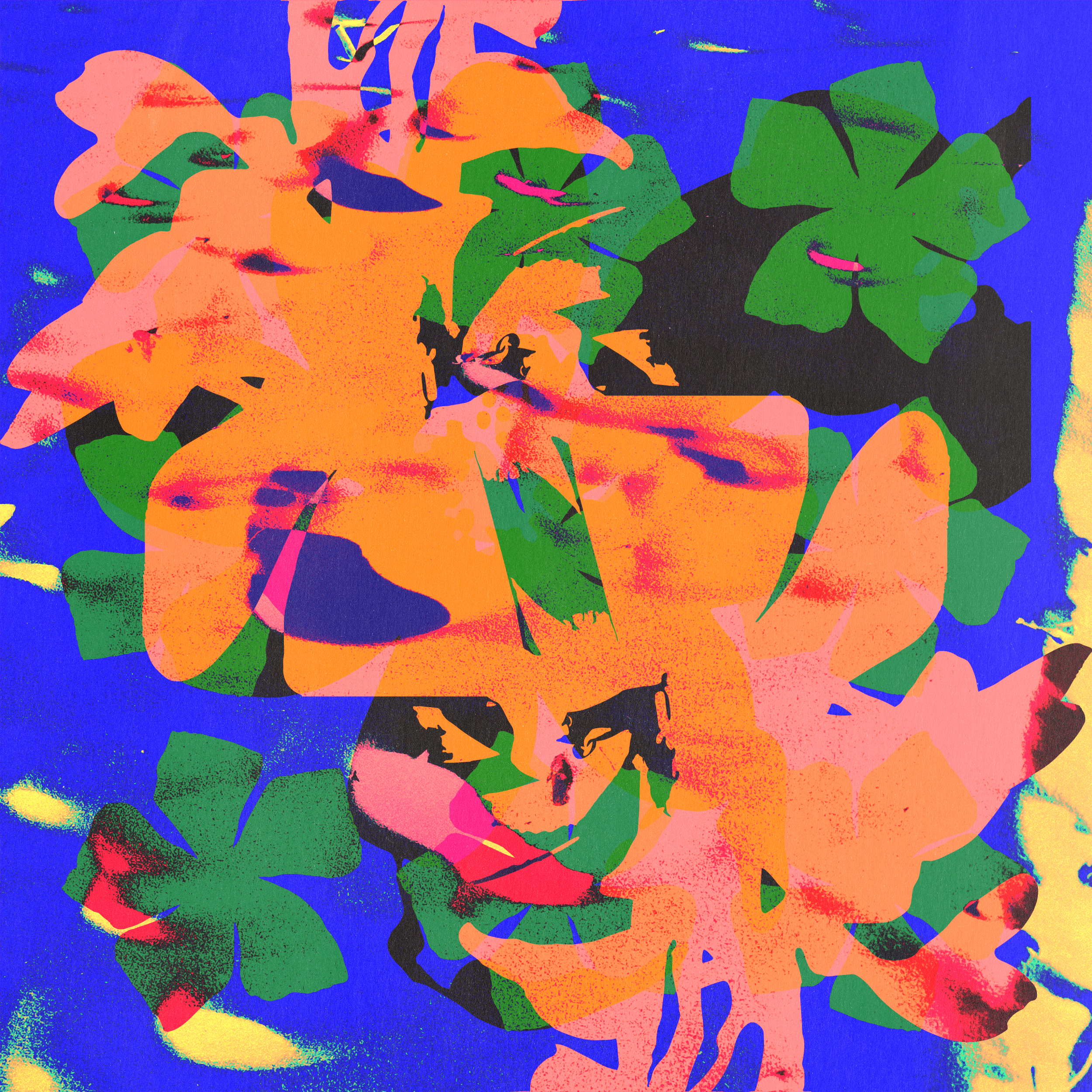
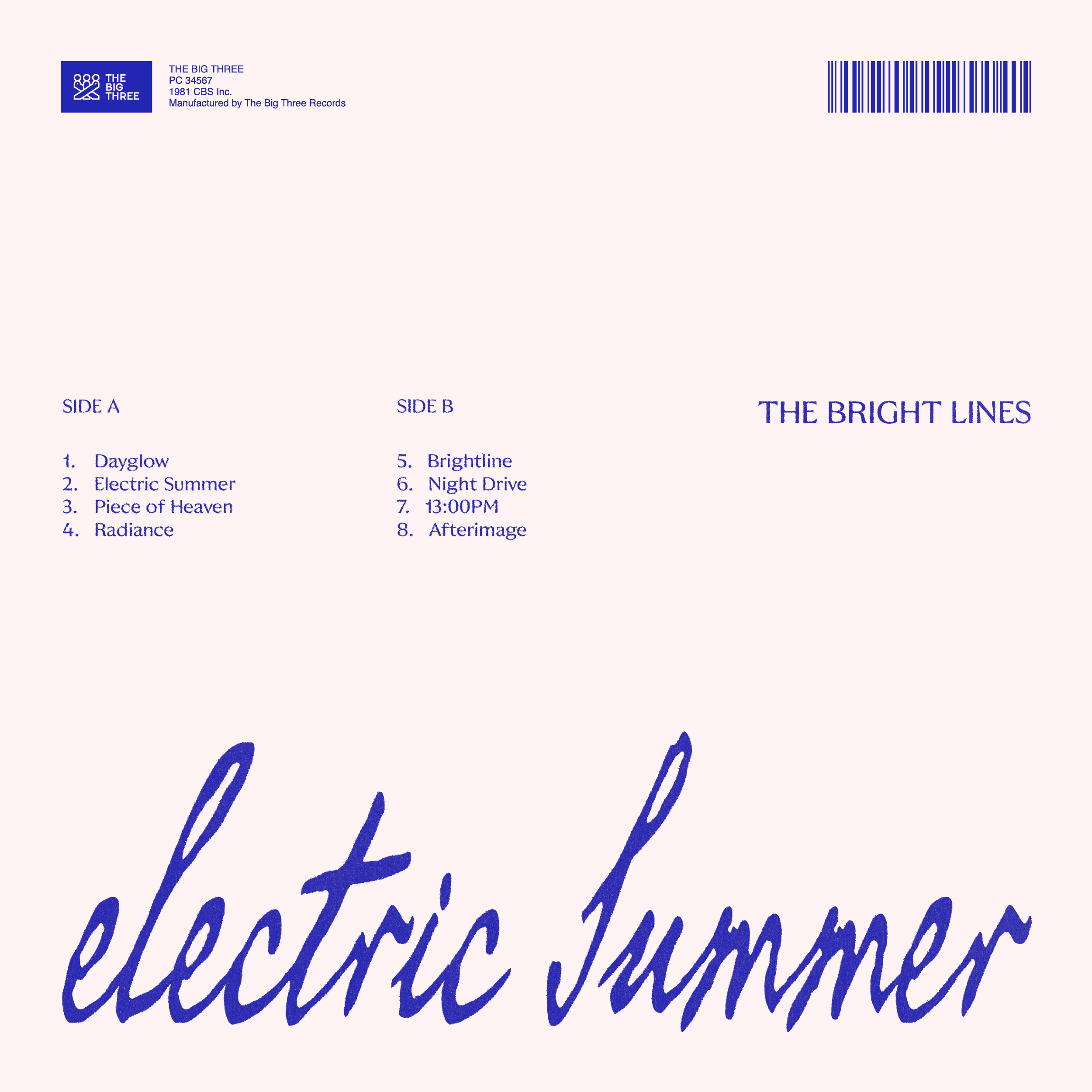
An experimental dance record capturing fleeting summer nights and the afterglow of memory. Approached more like an art piece, the cover layers photographs of flowers into a symmetrical collage, with grain and texture adding warmth and nostalgia.
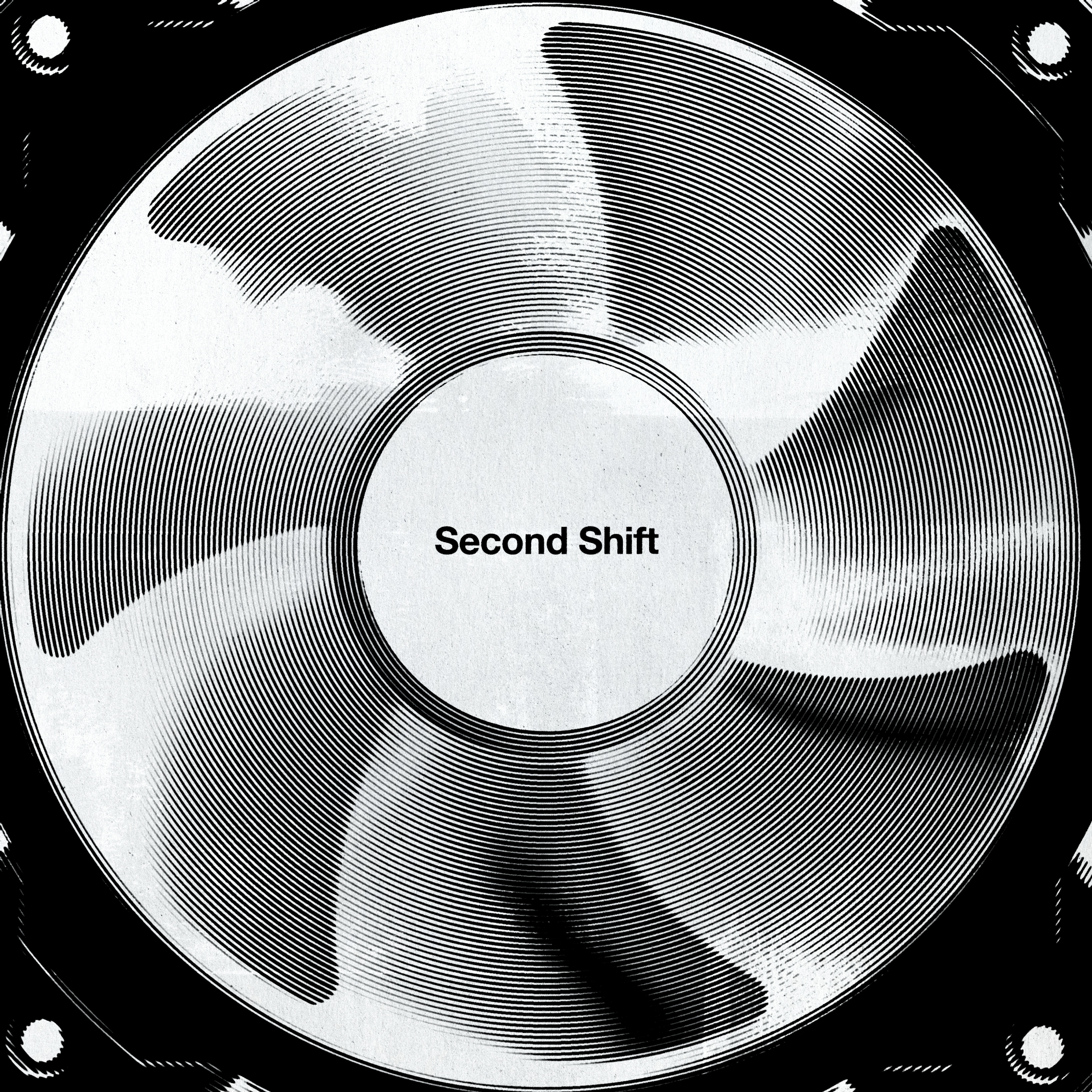
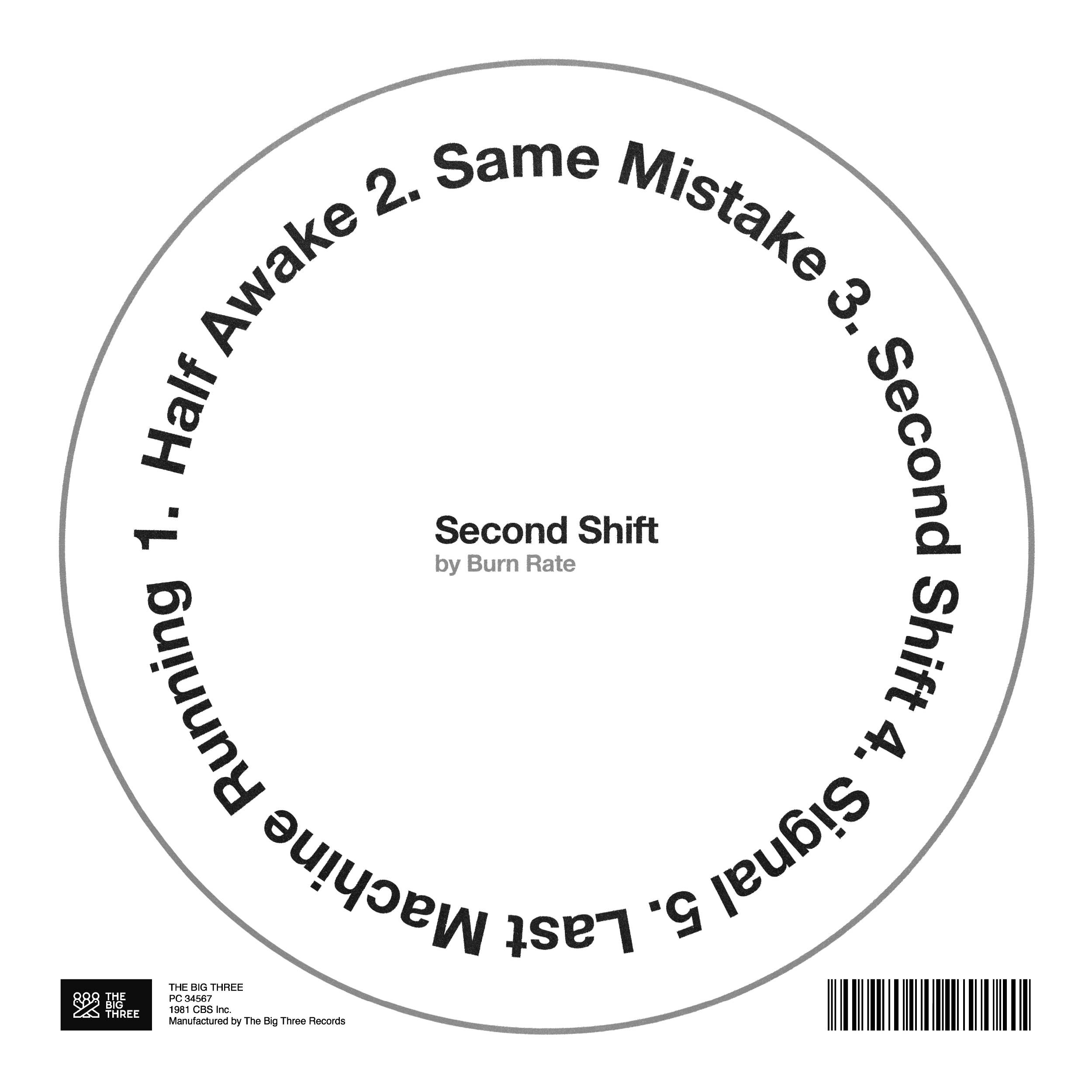
Second Shift by Burn Rate
A dark industrial-alternative record about life inside repetitive systems. The design leans into cold, mechanical imagery. A stark monochrome palette and circular forms carry the album's themes of work cycles and repetition.
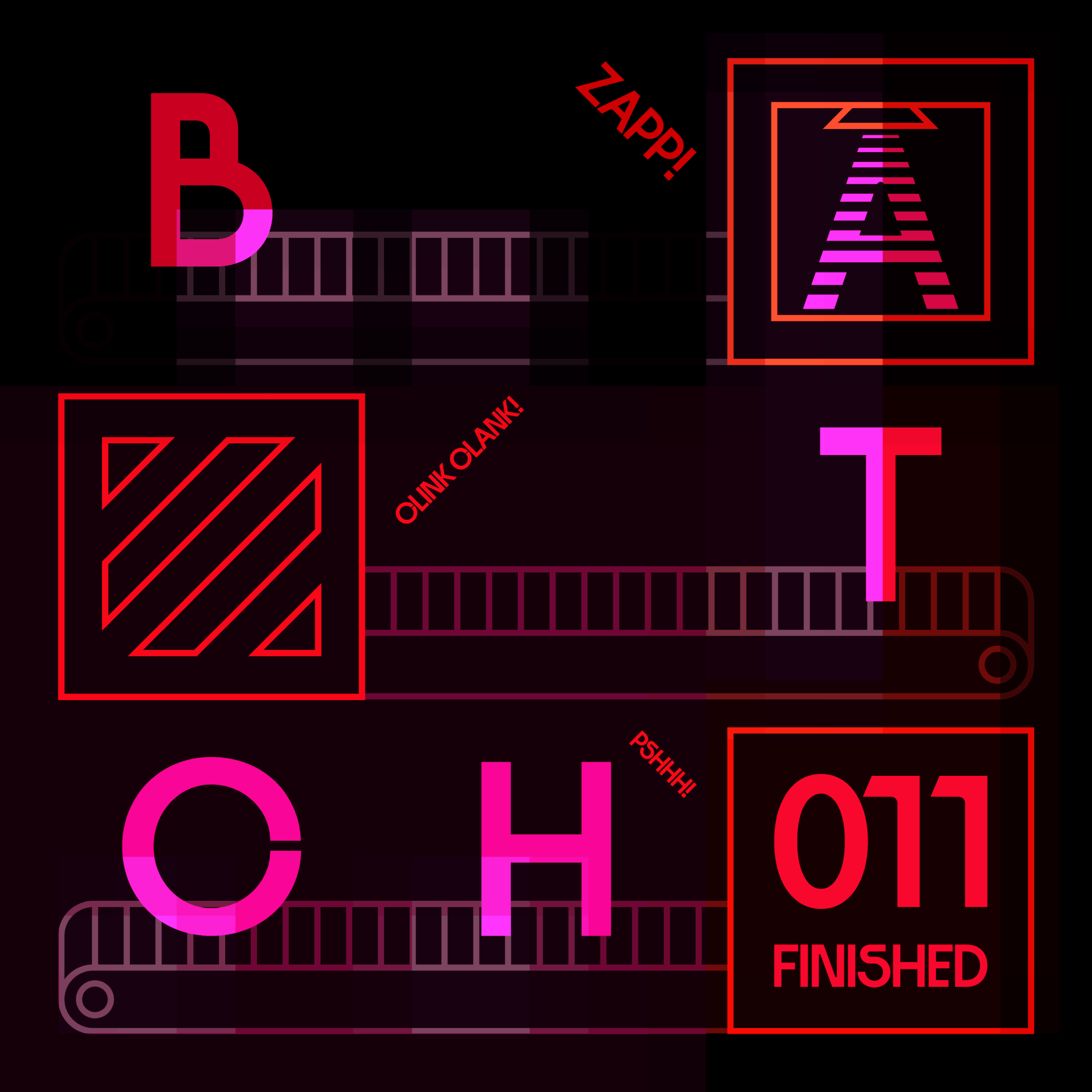
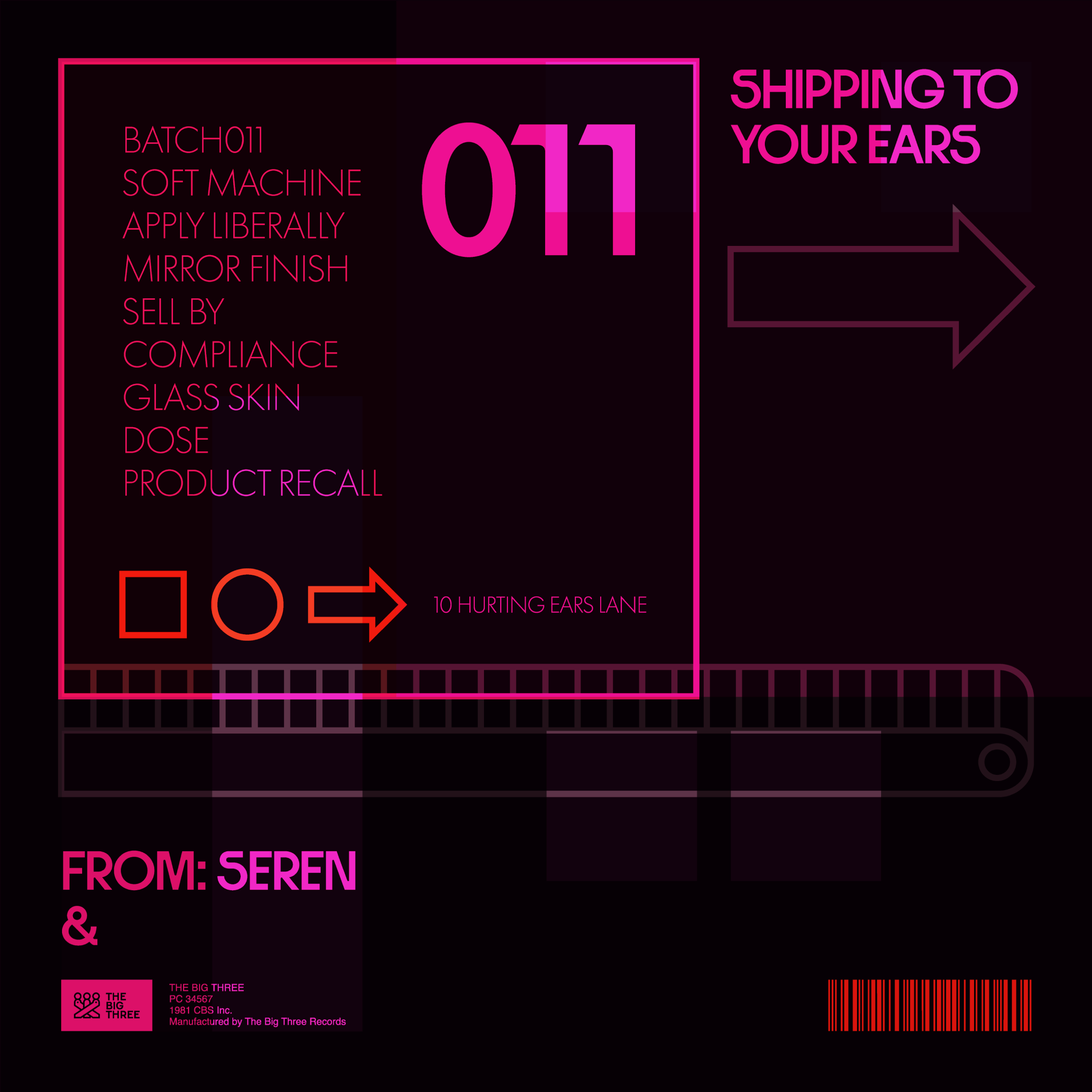
BATCH011 by SEREN
SEREN isn't an artist, it's a product and the design treats it like one. Inspired by micro graphics found on shipping containers and delivery packaging, the artwork depicts the music as items on an assembly line: constructed by machines